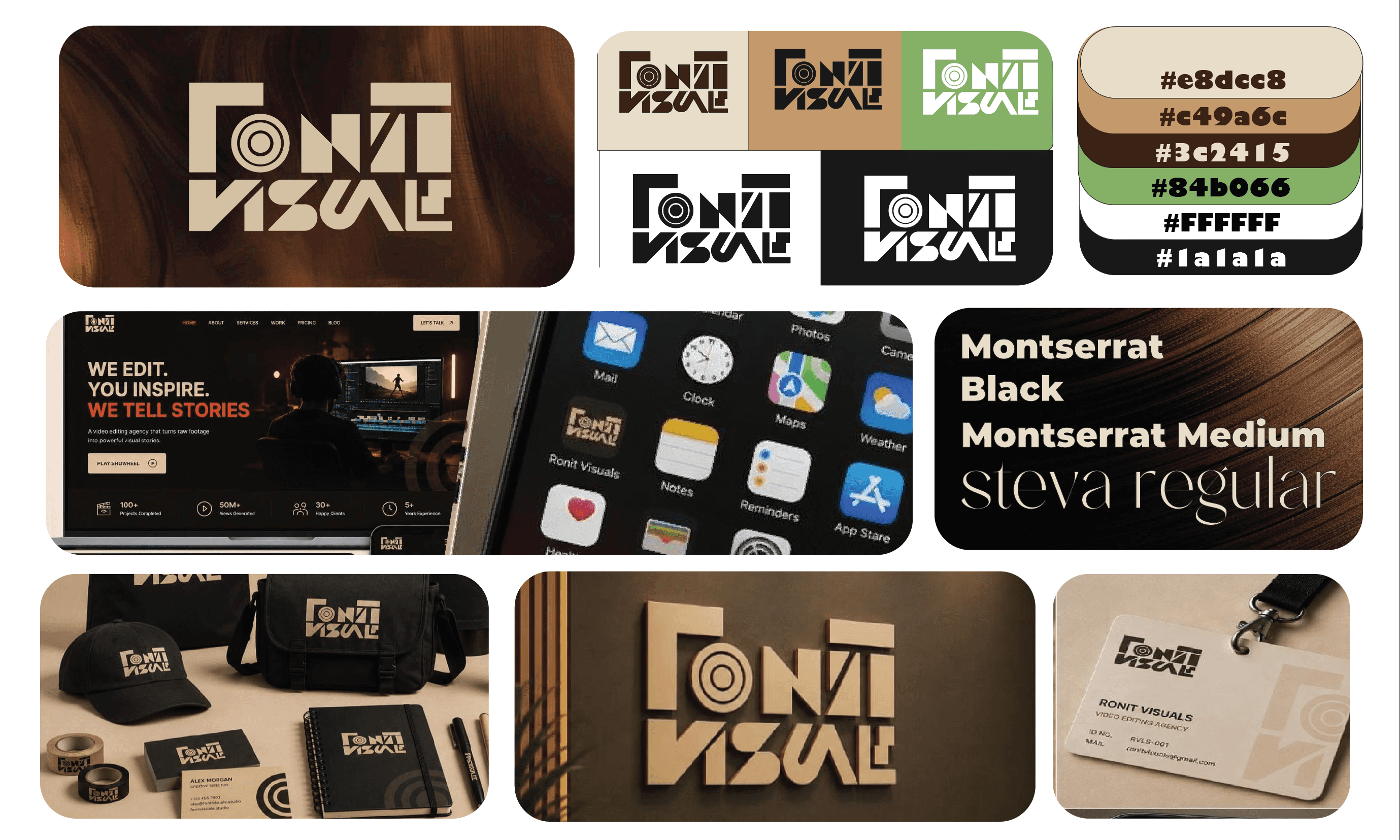
Ronit Visuals is a video editing agency that needed a more refined identity to reflect the quality and modern direction of its work.
The rebrand focused primarily on creating a new logo that could communicate video editing without relying on the obvious, generic visual language commonly used by creative agencies.
THINKING
The previous identity felt more basic and less aligned with the level of work Ronit Visuals wanted to communicate.
I wanted the new logo to feel cleaner, more sophisticated and distinctly modern, while still having a visual connection to the world of video editing.
Instead of using a straightforward play button or camera symbol, I looked at the actual visual components of editing — layers, frames, sequences and the way different elements come together to create a finished visual.
The goal was to make those ideas part of the construction of the logo itself.
EXPLORATION
I explored how layered shapes and editing-style components could form the structure of the mark.
The challenge was to keep the visual reference to editing recognizable without making the logo look like an editing-software icon.
So the forms were simplified and refined until the editing reference became embedded into the geometry rather than illustrated literally.
DECISION
The final logo uses a layered construction inspired by video-editing elements.
The overlapping forms create a sense of frames, layers and movement, while the overall geometry stays minimal and controlled.
This gives Ronit Visuals two things at once:
a clear connection to video editing + a more sophisticated visual identity.
MAKING IT HAPPEN
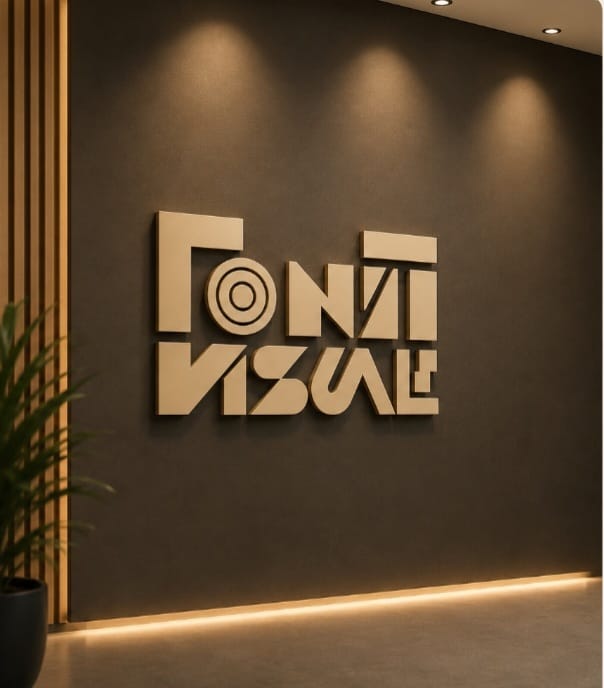
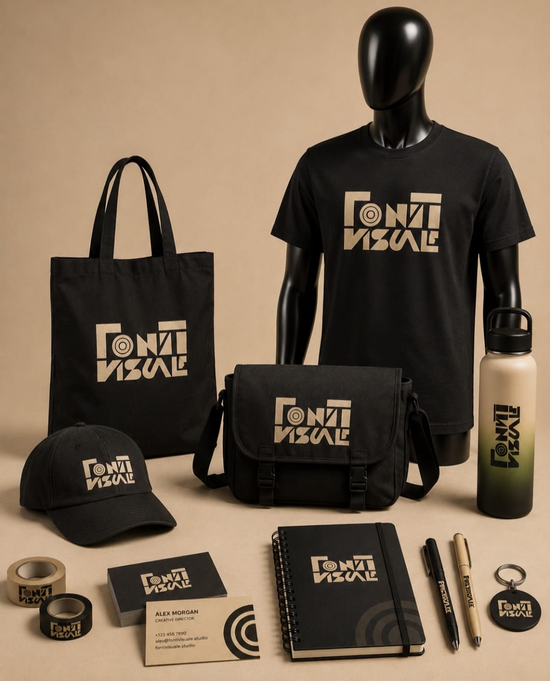
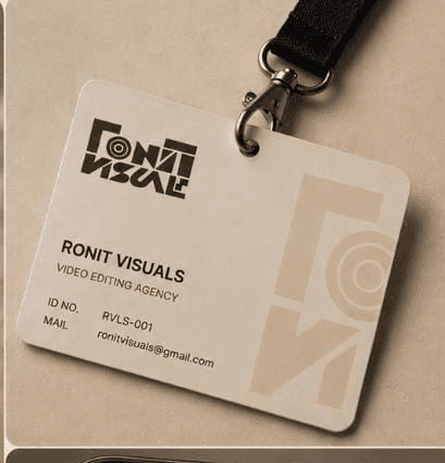
The final mark was developed to work beyond a single logo lockup.
Its simplified geometry allows it to function as a standalone symbol, digital icon and brand signature, while the layered construction gives the identity a visual characteristic that can be carried into other brand applications.
RESULT
The rebrand moves Ronit Visuals toward a cleaner, more contemporary and professional identity without losing its connection to video editing.
Rather than showing video editing literally, the logo builds the idea of editing into the mark itself through layers, structure and visual composition.
Category:
Logo Design
Client:
RONIT DAS
Duration:
1 WEEK
Location:
Kolkata, India



(06) / START A PROJECT
Tell me what you’re building. A few thoughtful details are enough to begin a good conversation.
BASED IN INDIA · AVAILABLE WORLDWIDE
