Ember & Oak is a coffee brand that approached me to develop its packaging and visual identity.
The main challenge was clear: they didn't want the brand to look like a typical café. They wanted the packaging to help them connect with people and communicate a stronger relationship with the origin of coffee, the land and the process behind it.
THINKING
I started by looking at what usually happens in coffee branding.
A lot of coffee brands communicate the café experience — cups, brewing, coffee beans, cosy interiors and familiar coffee imagery. But Ember & Oak wanted to sell through their packaging, so I felt the packaging needed to communicate something deeper than simply “this is coffee.”
I started thinking about where coffee actually begins.
Ground → plant → bean → harvest → process → cup
That made me think about roots, growth and time.
A coffee product has a story that begins long before it reaches the customer. I wanted the packaging to create a small connection between the person holding the product and that origin.
THE NAME
The client had already decided on the name Ember & Oak.
Instead of changing or adding another concept to the name, I looked at what was already there.
Ember immediately suggested warmth, fire and the experience of coffee.
Oak suggested nature, strength, roots and — most importantly — time.
That gave me a strong conceptual relationship between the two words.
I started asking how I could make the meaning of Oak visible without simply drawing an oak tree.
LOGO THINKING
The strongest reference came from the growth rings inside an oak tree.
When an oak is cut, its layers reveal how the tree has grown over time. Every ring represents another stage of its growth.
That felt relevant to the story I wanted Ember & Oak to tell:
growth → time → origin → craft
Instead of using an obvious tree illustration, I wanted to hide this idea inside the logo.
DECISION
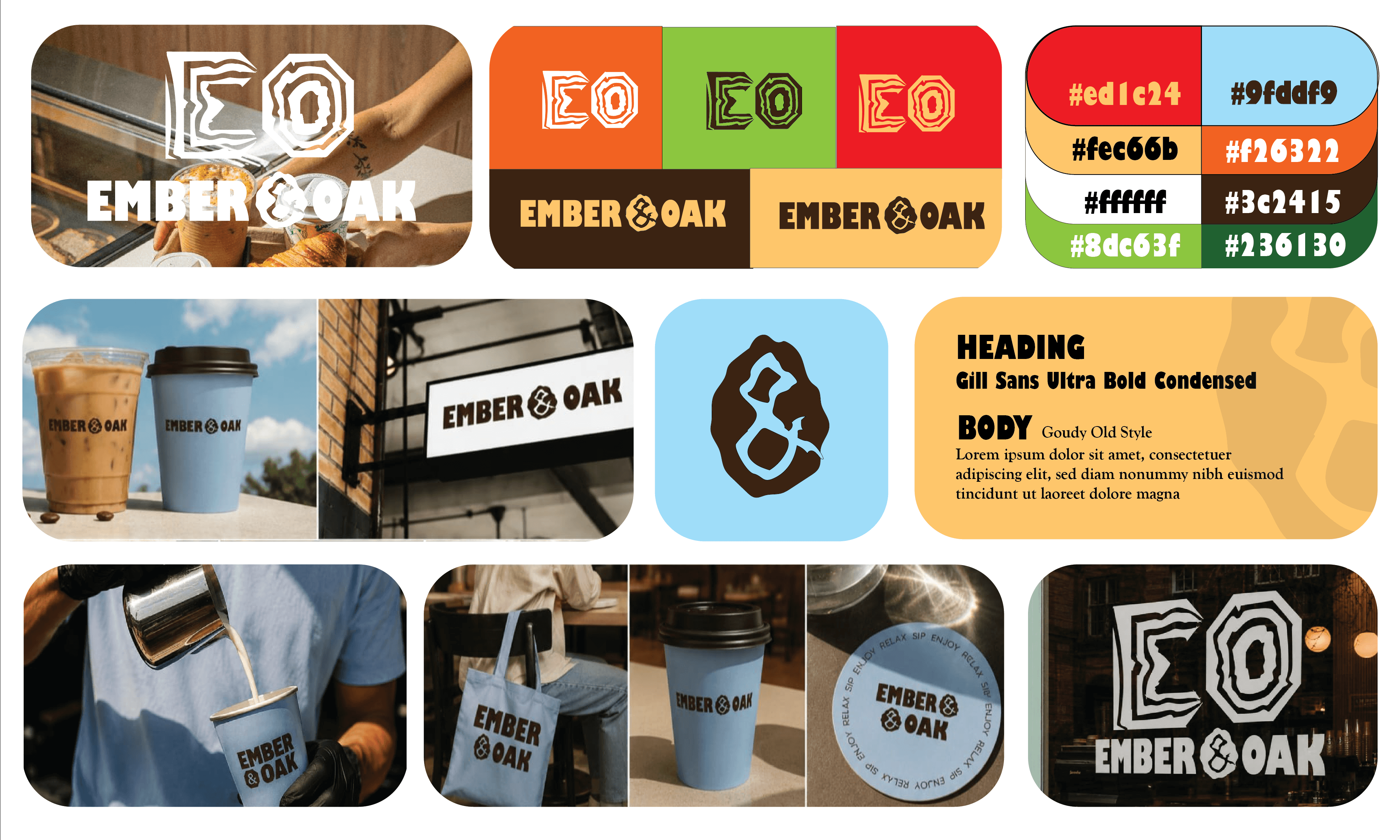
I developed the logo mark around the relationship between E and O.
The O becomes the inner structure, inspired by the rings of the oak, while the surrounding structure creates the relationship with the E.
This allowed the mark to communicate both parts of the name while carrying a meaning beyond simply being an EO monogram.
I wanted someone to be able to understand the mark visually first, and discover the story behind it afterwards.
TYPOGRAPHY
The typography needed to support the same balance.
The name Ember & Oak already has a natural, grounded character, so I avoided making the wordmark overly decorative or overly rustic.
I chose a contemporary typographic direction that could feel premium and modern while still belonging to a brand connected to nature and craft.
The typography then became part of the identity system rather than being treated separately from the logo mark.
MAKING THE IDENTITY HAPPEN
Once the logo was established, I didn't want the oak-ring idea to exist only inside the logo.
I developed the structure into a brand watermark and supporting graphic language.
This gave the identity another layer of recognition. The customer doesn't always need to see the complete logo to recognize the brand.
The oak structure becomes the visual memory of Ember & Oak.
I also incorporated an ember-inspired detail into the “&”, connecting the two ideas in the name and making the wordmark itself more ownable.
PACKAGING THINKING
The packaging was the most important application because this is where the customer actually meets the product.
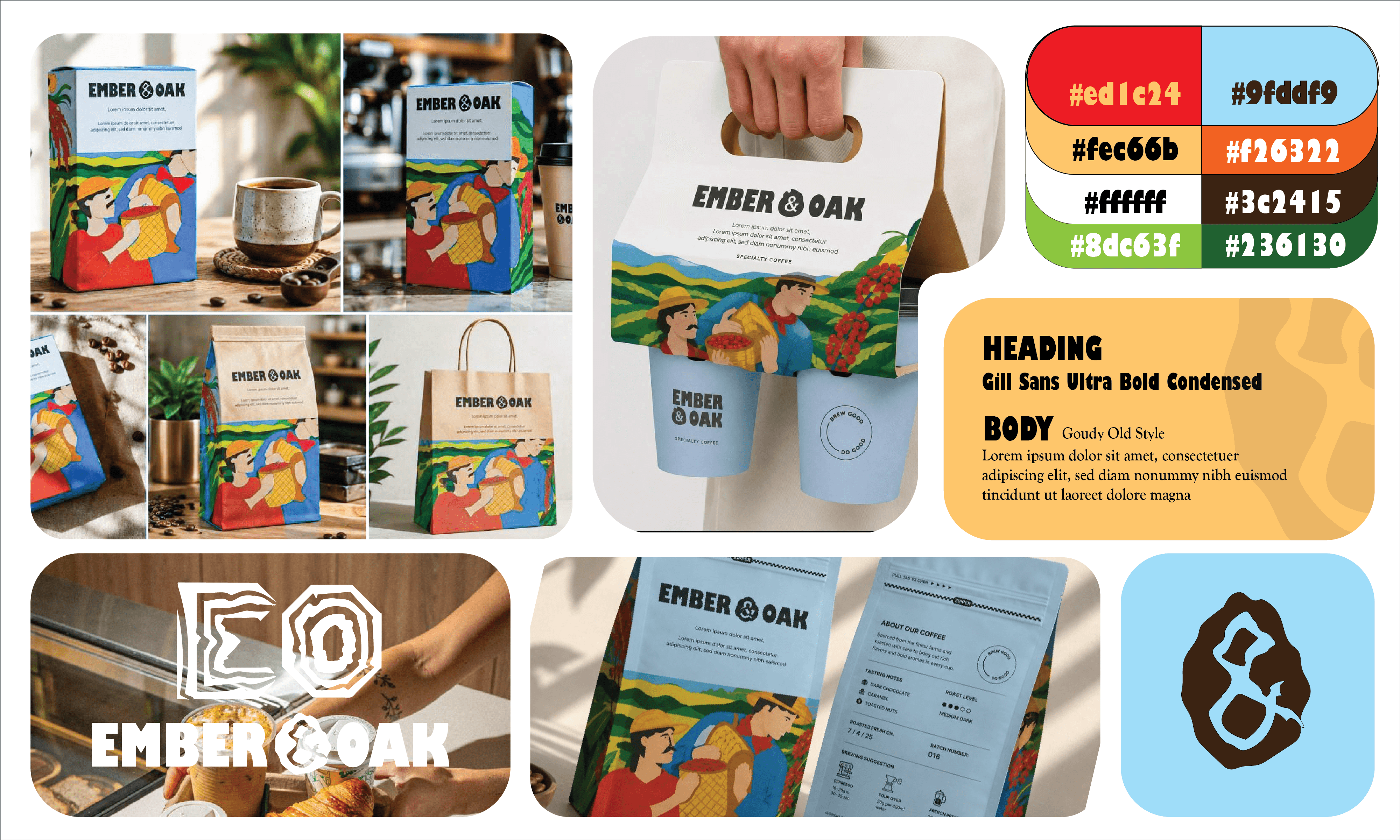
I wanted the package to communicate the journey behind the coffee rather than simply decorating it with coffee imagery.
The visual story moves back toward the origin of the beans — the ground, the plant, the cultivation and the eventual journey toward the cup.
This makes the packaging feel more connected to the product instead of feeling like a generic café package.
PACKAGING SYSTEM
I then carried the identity across the different physical touchpoints.
The same visual language was applied to:
Coffee packaging → takeaway cups → brand materials → digital presence → other customer touchpoints
The goal was consistency without making every application look identical.
The logo establishes recognition.
The oak-ring graphic establishes the brand's visual memory.
The typography creates the modern character.
The packaging imagery communicates the origin story.
RESULT
The final system positions Ember & Oak as a coffee brand rather than simply a café identity.
The brand uses the ideas already present in its name — warmth, nature, growth and time — and turns them into a visual system.
Most importantly, the packaging becomes part of the communication.
It doesn't just hold the coffee.
It gives the customer a reason to connect with where the coffee comes from..
Category:
Logo & Packaging Design
Client:
FIVER WORK
Duration:
1 - 2 Weeks
Location:
Berlin, Germany


(06) / START A PROJECT
Tell me what you’re building. A few thoughtful details are enough to begin a good conversation.
BASED IN INDIA · AVAILABLE WORLDWIDE
