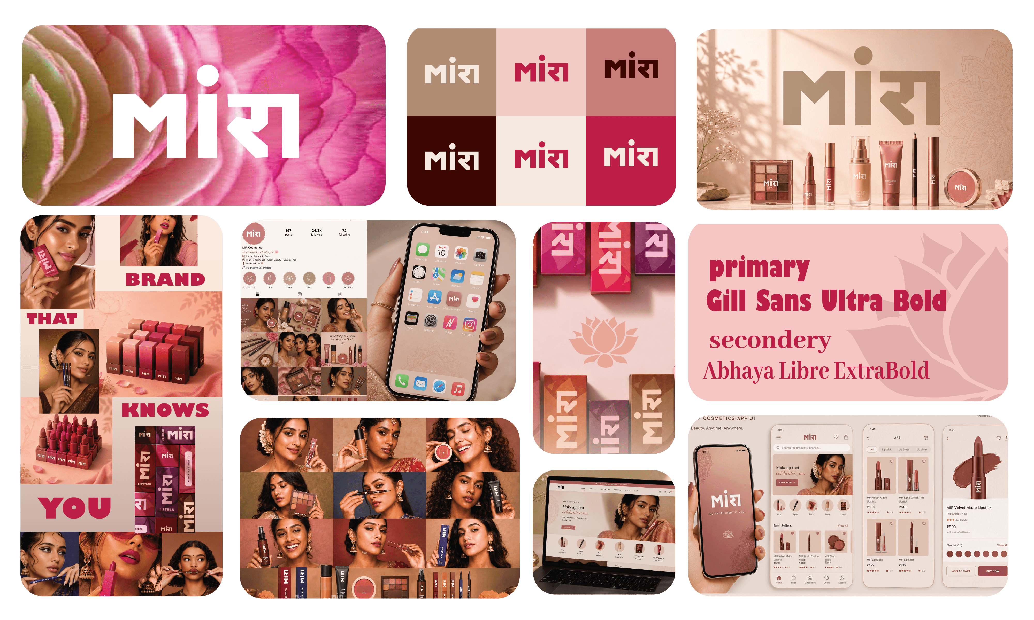
MIRA is an Indian beauty brand developed around a simple question:
Can an Indian beauty brand feel culturally familiar, offer beauty products made with Indian skin tones in mind, and still feel contemporary and memorable?
THINKING
I wanted the brand to feel rooted in Indian culture before it even became visual.
The name MIRA came from the cultural association with Meera, connecting the brand to the story of Meera and her devotion to Krishna. I liked that connection because it gave the brand an Indian emotional foundation without forcing the identity to visually depend on religious imagery.
At the same time, MIRA is short, easy to remember and naturally feels contemporary. That gave me a starting point where cultural meaning and modern beauty could coexist.
From there, I decided that the cultural connection shouldn't become the entire visual direction. Many beauty brands communicate their origin through obvious cultural symbols, which can make the identity recognizable but also predictable.
So I wanted the culture to feel discovered through the brand, rather than announced through it.
DECISION
I chose a more expressive and crafted visual language instead of building MIRA around obvious Indian beauty clichés.
The logo became the first expression of that idea — simple enough to feel contemporary, but distinctive enough to give the brand its own personality.
For the supporting identity, I introduced the lotus as a more subtle cultural and beauty symbol. It allowed me to bring in the Indian connection without making the brand feel overly traditional.
I also explored traditional-inspired patterns as a supporting background element, giving the packaging a stronger Indian character while allowing the main typography and layout to remain modern.
MAKING IT HAPPEN
Once the core identity was established, I carried the same thinking into the packaging.
The logo creates recognition, while the lotus and traditional pattern create the cultural layer. Colour and product information then provide differentiation between the different beauty products.
This meant each element had a job:
Logo → recognition
Lotus → cultural & beauty connection
Pattern → Indian character
Colour → product differentiation
Packaging system → shelf recognition
RESULT
The result is a beauty identity that doesn't try to look Indian through decoration alone.
Instead, MIRA combines cultural meaning, symbolism and contemporary beauty language to create a brand that feels rooted, memorable and relevant to the people it is designed for.
Category:
Brand Identity & Packaging
Client:
Sanjeevit Mark
Duration:
1-2 Weeks
Location:
mumbai,india


(06) / START A PROJECT
Tell me what you’re building. A few thoughtful details are enough to begin a good conversation.
BASED IN INDIA · AVAILABLE WORLDWIDE
