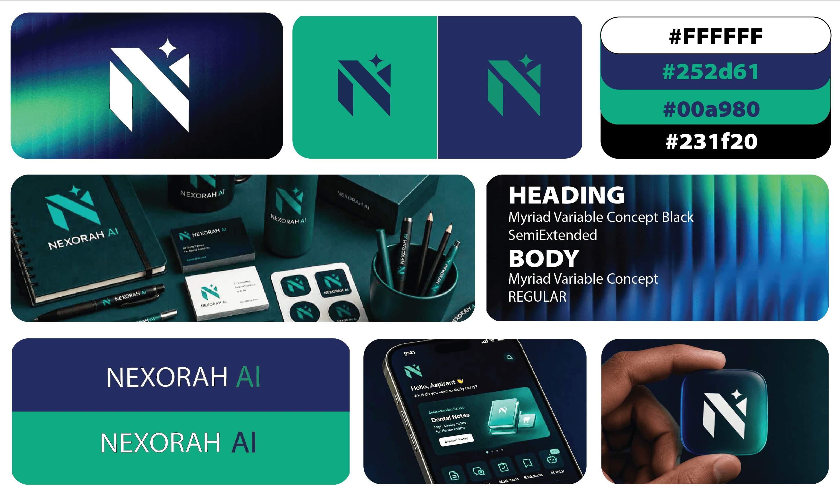
Nexorah AI is a Dubai-based dental education technology company using AI to help dental students learn, practise and prepare more effectively.
The project was primarily focused on creating a distinctive logo and identity mark for the digital product, with supporting applications across the company's ecosystem.
THINKING
Because the product sits between AI, education and dentistry, I wanted to avoid making the identity feel like a typical AI startup or a traditional dental brand.
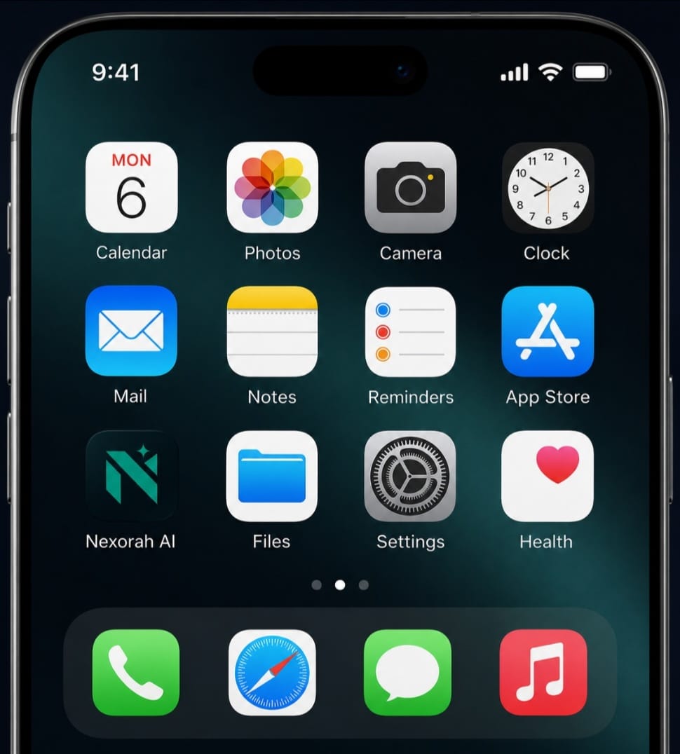
The logo needed to work especially well inside an app, where it would often appear very small. So the challenge was to create something that could communicate intelligence and progress without depending on complex detail.
I started with the idea of growth.
Learning is a process of moving from one level to another, and I wanted that progression to be present in the structure of the mark rather than simply explained through the brand messaging.
EXPLORATION
My first direction explored a spiral form, using continuous movement to represent learning, progression and development.
The idea had the right conceptual foundation, but when I considered how the identity would behave as an app icon, I felt it became less immediate than it needed to be.
That pushed me toward a simpler and more recognizable interpretation.
DECISION
I developed the final mark around the N of Nexorah.
The structure of the N represents growth and forward movement, while the star represents intelligence, insight and the AI layer.
I chose to integrate these ideas into one mark rather than adding separate symbols for dentistry, education and technology.
This kept the identity simple enough for digital use while still giving the mark a meaning beyond the letter itself.
MAKING IT HAPPEN
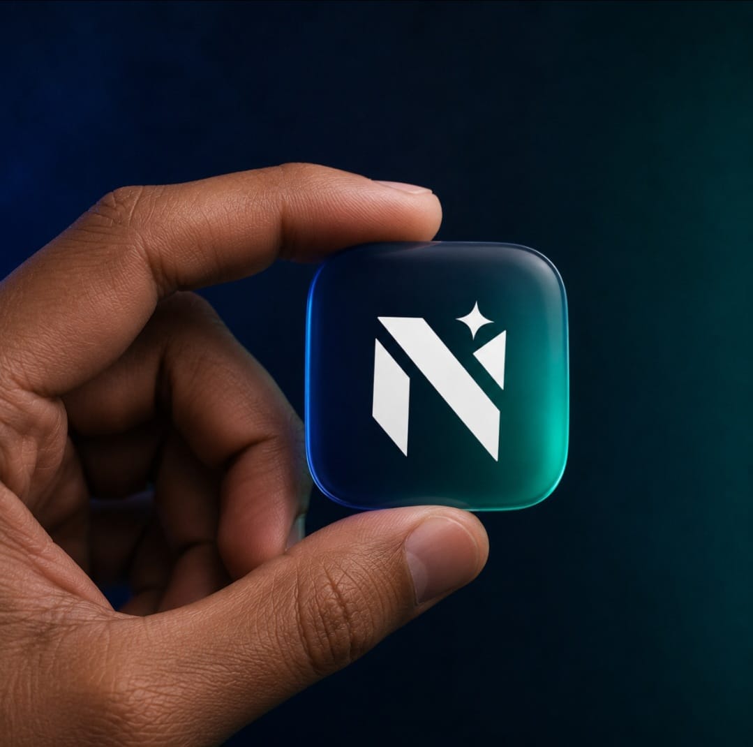
Once the direction was approved, I tested the mark first where it mattered most — the app icon.
From there, I extended the same identity across the smartphone interface, website and supporting company materials.
The mark was also applied to practical brand touchpoints such as notebooks, water bottles, pens and gifting items, showing how the identity could move from a digital product into the wider Nexorah ecosystem.
RESULT
The final identity gives Nexorah AI a recognizable visual anchor built around growth and intelligence, while remaining simple enough to work at the small scale required by an app.
The approved direction turns a simple N into a symbol for the company's larger idea:
learning → growth → intelligence.
Category:
Logo Design
Client:
Nexorah AI
Duration:
1 Week
Location:
Dubai, UAE




(06) / START A PROJECT
Tell me what you’re building. A few thoughtful details are enough to begin a good conversation.
BASED IN INDIA · AVAILABLE WORLDWIDE
